Hang On
The best hangboarding, training experience.
Hang on
Hang on was a team project within Fontys. We had to produce an application that would improve the hangboarding experience for boulderers. Hangboarding can help with finger/grip strength improvement. This is an especially important part of bouldering/climbing.
The assignment:
Create a good exercise experience that uses a hangboard in combination with an app and a screen for grip strength training.
My role:
UX research, UI Design, Logo Design.
Work method:
Agile scrum, design thinking.
Chapter 1
Research
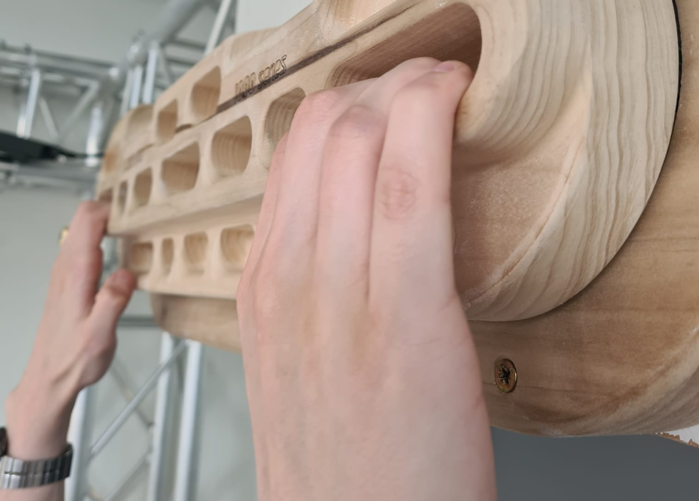
What is hangboarding and bouldering?
Since hangboarding and bouldering were completely new topics for me and the team, we had to first understand what these things were, since boulderers are our target audience. We had to get a good understanding of the sport, what motivates people, how the sport works, why/how do people hangboard.
We started doing research into the sport itself, by online reading, watching documentaries, talking to the stakeholder, interviewing boulderers. Once we had a good understanding of the topic, we could start with research into the target audience and competitors.
User research.
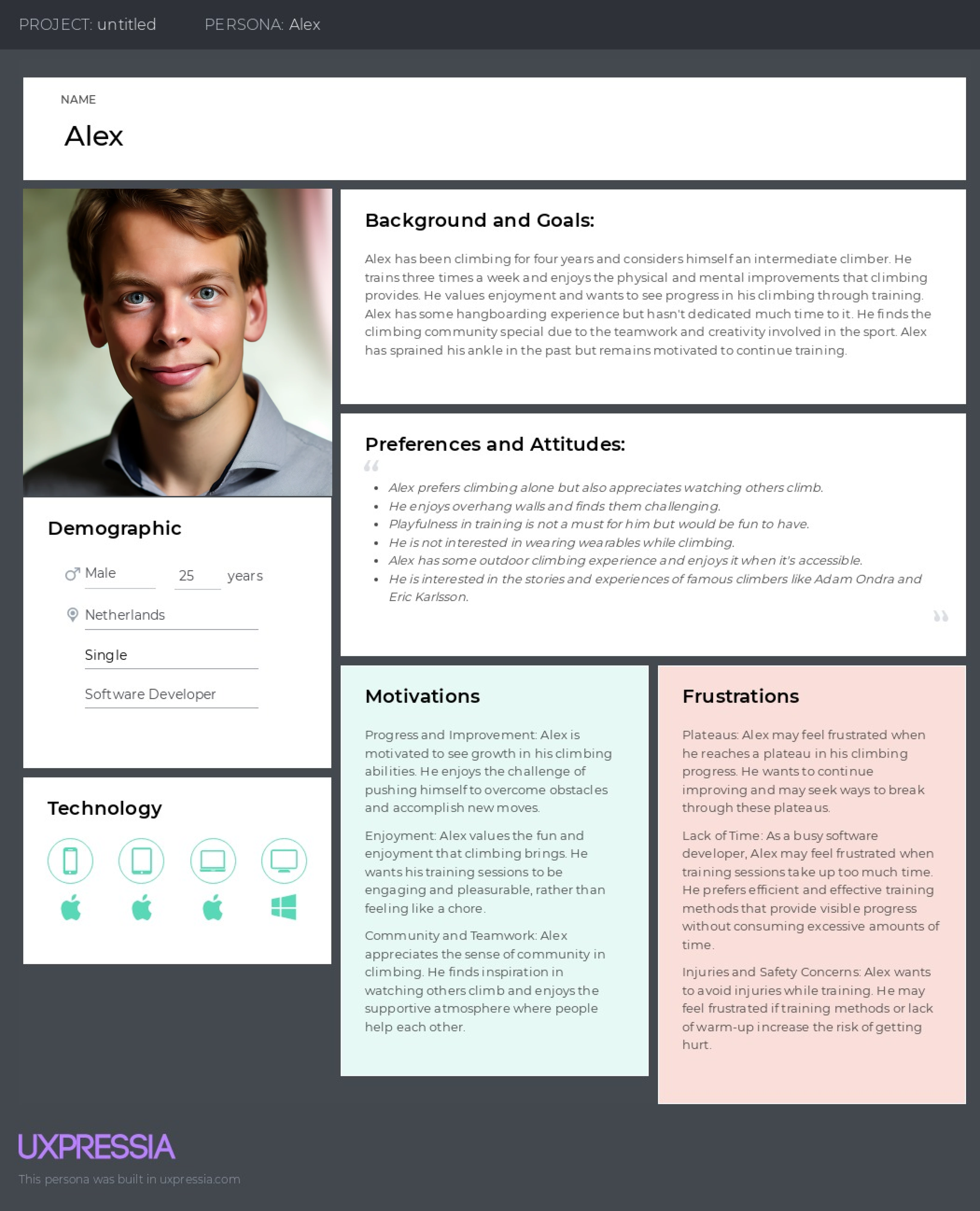
The target audience, whom are boulderers, had been provided by the stakeholder. We had to learn more about the target audience to create an optimal hangboard exercise experience. We started by doing interviews with people in a local boulder gym.
We also found online forums and chat groups and started having conversations with the target audience. What we found is that different level of boulderers have unique needs for the hangboard. Beginners to intermediate boulderers are defined by bouldering grades. They have a need for hangbourding on a regular basis since they have not formed a strong finger strength.
What we also found out is that the average user does not enjoy hangboarding, they require added stimulation like music or other elements like gamification. Advanced-level climbers don't hangboard in general, but most of them would hangboard if it's a competition with other climbers to prove who can hang the longest.
Competitor analysis
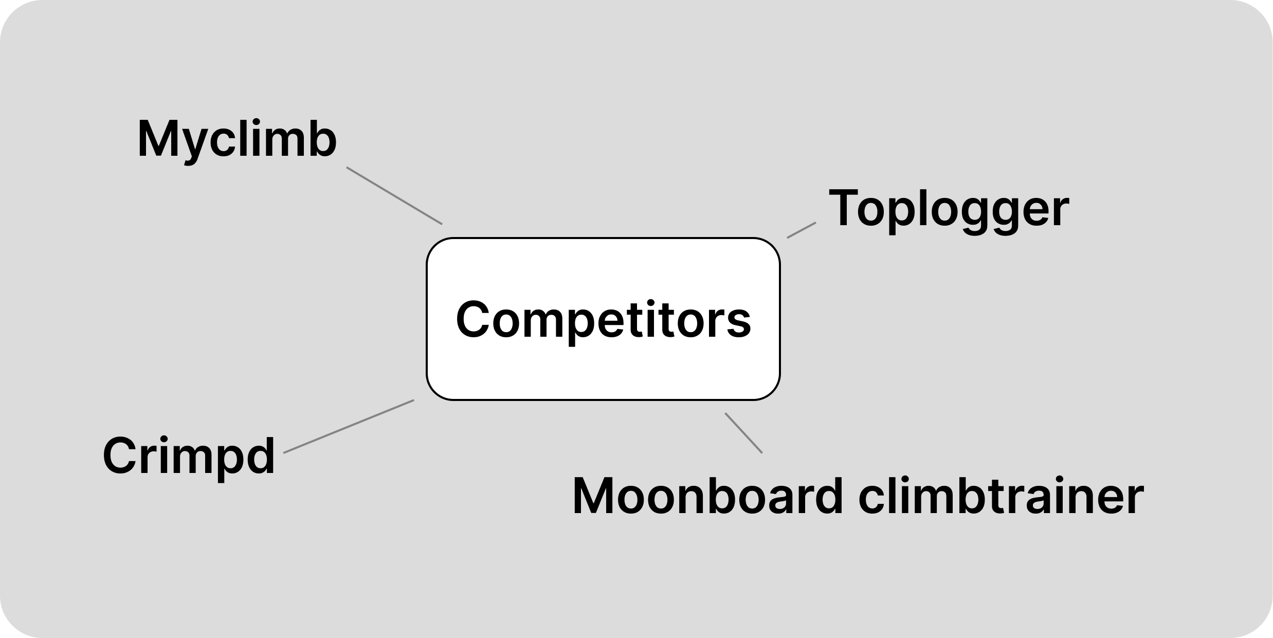
By checking how other hangboarding/bouldering related apps provide a better exercise experience, we could use that information to implement in hang on. We checked various apps and found out that most apps offer basic exercise schemas, but they lacked most forms of gamification, it usually remained limited to only obtaining badges. Most popular apps did provide a social element by letting users connect with other users.
Chapter 2
Analysing & defining, ideate
Challenges and Gamification are key
Based on our research we found out that to make hangboarding a fun experience we must gamify and implement forms of competition. This can be achieved by having various exercises and challenges based on a user’s boulder grade and let them compete in different in-app events and leaderboards.
The concept
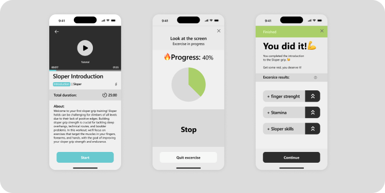
We were going to build a level-based exercise/challenge filled app that lets you compete with other boulderers, or train by yourself. The app is connected to the hangboard and a screen in front of the board which would display the challenge and visually stunning videos. The hangboard itself can record data as well so the results are automatically stored. The exact features were placed in a MoSCoW overview.
Chapter 3
Prototyping, Iterating.
Lofi-prototyping
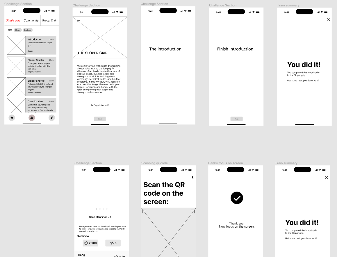
For the consumer-facing app, we used Figma to create high-fidelity prototypes. We adhered to modern design principles, emphasizing essentialism and simplicity. Our primary focus was on making the app easy to use, ensuring that the most important information and features were readily accessible on the main screen. This included the QR code, which served as the central feature for users to access their loyalty points and rewards.
Hifi-prototyping
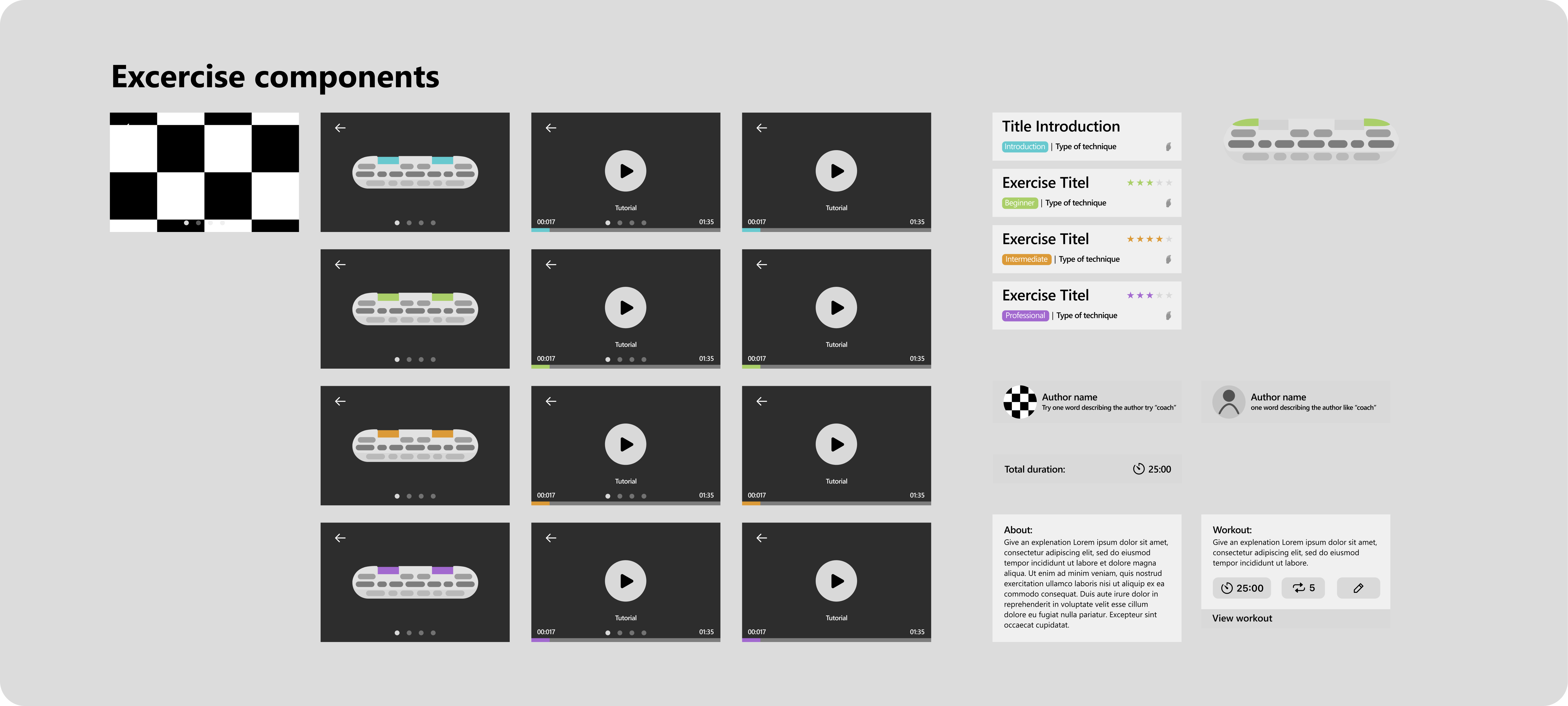
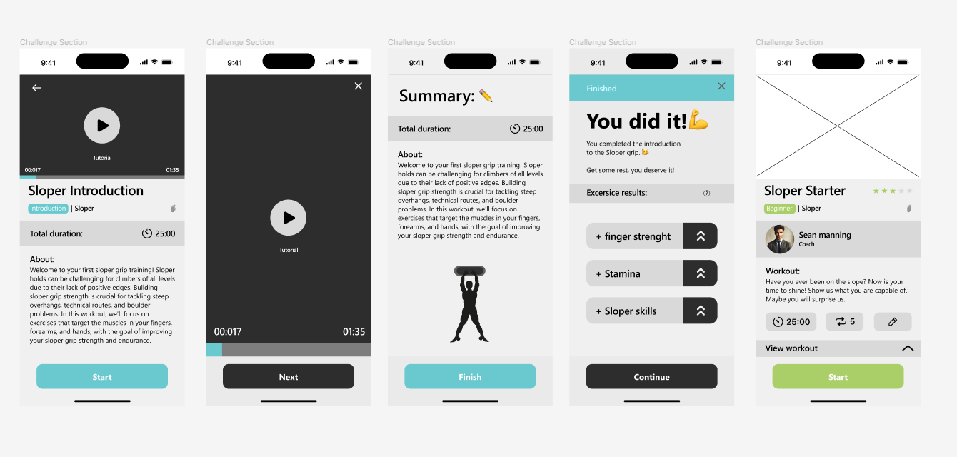
The hifi-prototypes have been through a couple of iterations. I tested the design on users and made sure to implement their feedback. One of the main differences between the earlier and later versions of the design is the exercise layout. This substantial change came because the users noticed that when doing an exercise, they would get tired and had less focus when reading, and since all the exercises had the same colours even resting everything looked the same, by adding colour, the user got a better overview of the exercises.
Chapter 4
Validation
User testing
For user testing I used Maze. This tool offers the ability to test various parts of Figma prototypes and gain valuable insights into results of tests. As specified earlier, adding colour to exercises was done after testing with Maze, also the hierarchy of the exercise description has been changed after testing since the user prioritized certain information we had not expected.
Results
Hang on proved to be a helpful tool for beginners with hangboarding but also a fun competitive tool for advanced boulderers. In the end I provided the stakeholder with an advisory document which was going to be used for further development by other students.
Let's talk.
My work
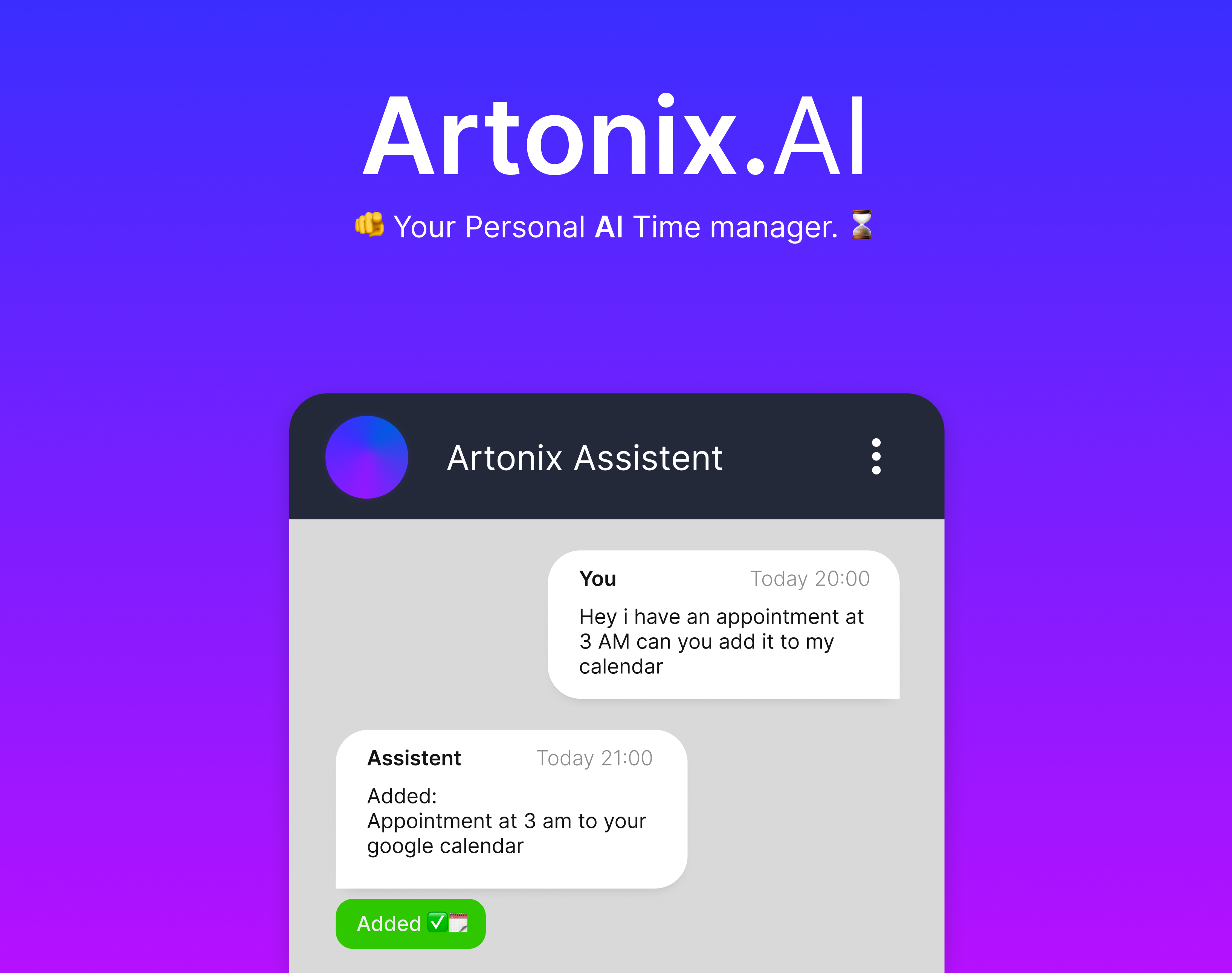
Artonix.AI
Artonix is an AI-powered scheduling assistant that seamlessly integrates with messaging platforms like WhatsApp. It helps users manage their calendar, set reminders, and organize tasks using natural language, making planning effortless and intuitive.
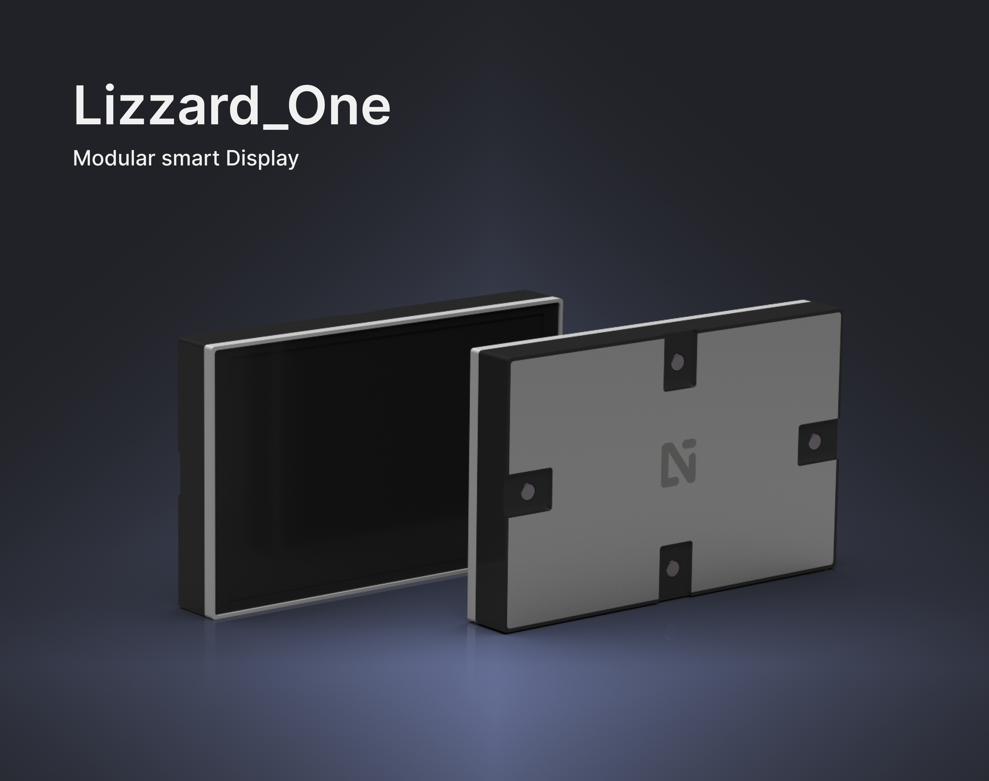
Lizzard_One
Lizzard_One is a modular smart display that adapts to any space, displaying artwork, gaming visuals, or ambient scenes. Seamlessly controlled via smartphone or voice assistant, it transforms your environment with a single tap.
